On this page, we'll talk about the tools available to help structure a page.
Text Alignment and increase/decrease indent
Use Align Text  , Indent
  and Outdent
  to apply formatting as expected.
The Justified  and Center-aligned
  text formats are inaccessible and should not be used.
Horizontal Rule
The Horizontal Rule  button can be used to visually separate content sections by inserting a horizontal line into the page. Use these sparingly and never in place of headings.
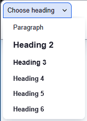
Headings
The Heading dropdown menu allows you to add headings to your content. Headings provide a clear structure that helps readers quickly scan content and improve accessibility for screen readers. Use the heading drop-down (see below) to select the desired heading as follows:
- Start the page content with H2
- Follow a logical hierarchy: Title, H2 (major sections), H3 (subsections), etc.
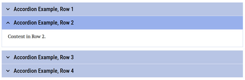
Accordions
Accordions  are used to save space, reduce scrolling, improve page scannability, and make interfaces less overwhelming. Unfortunately, they also essentially 'hide' content from students and make the content unsearchable unless the row is open, so accordions should be used strategically and sparingly. If you would like to use an accordion, contact your learning designer to set it up. They will make sure it meets current federal accessibility requirements and follows pedagogical best practices. Once the accordion has been created, you will be able to edit it as needed.
To edit an Accordion,
- Place your cursor in the Row Title or Row Content.
- Edit the field contents as you normally would using the editor.
- Add or delete a row, click in the text field, and select Insert row above, Insert row below, or Delete row from the pop-up window.
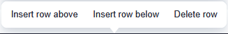
Note: The pop-up window appears at the top of the accordion, not the row where your cursor is. You need to click the title or row where you want to add or delete, scroll to the top or bottom of the accordion, and make your selection.
Lists
Use the Bulleted List button  and Numbered List button
  in the toolbar rather than using numbers and letters from the keyboard. Using the buttons ensures accessibility for screen readers – and it’s much easier to do.
Blockquote
Use Blockquote  for true quotations only. Do not use Blockquote to add emphasis or for formatting reasons. Talk to your learning designer about accessible and responsive options for adding emphasis, like a text box.
Getting help
Your learning designer is your partner in building effective and engaging online courses. Whether it’s navigating Drupal or refining your content, we’re here to assist. Please don’t hesitate to contact us with questions.